Table of Contents
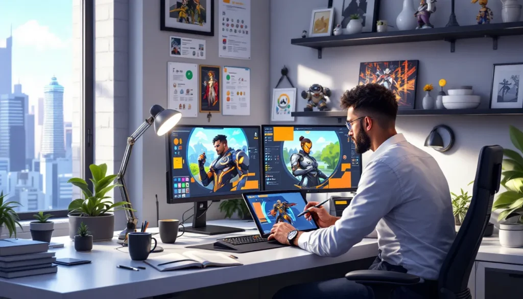
ToggleWhen Overwatch launched in 2016, it didn’t just introduce a new hero shooter, it delivered a visual identity so distinct that you could spot a character silhouette from across the room. That instant recognition? It’s no accident. Behind every hero, map, and skin lies hundreds of hours of concept art, iteration, and creative problem-solving from Blizzard’s art team. From the early days of Project Titan’s ashes to the vibrant, globe-trotting world players know today, Overwatch’s concept art isn’t just pretty pictures, it’s the foundation of everything that makes the game feel cohesive, readable, and alive. Whether you’re a fan hunting for official artwork, an aspiring game artist studying Blizzard’s techniques, or just curious about how Tracer got her goggles, understanding the concept art process reveals why Overwatch looks like nothing else on the market.
Key Takeaways
- Overwatch concept art establishes critical gameplay functionality by prioritizing silhouette clarity and color coding, enabling players to identify heroes instantly during chaotic teamfights.
- Blizzard’s art direction balances “heroic optimism” with realistic materials and lighting, drawing inspiration from Pixar and Team Fortress 2 to create a visually distinct aesthetic that stands apart from other shooters.
- Cultural authenticity is built into Overwatch concept art through research partnerships, local collaborators, and iterative design—ensuring heroes like Symmetra, Hanzo, and Genji respect their cultural sources without stereotyping.
- The concept art process for heroes involves dozens of silhouette studies, color palette development, and collaborative feedback from 3D artists, animators, and designers to balance aesthetic vision with gameplay constraints.
- Overwatch 2’s concept art signals a deliberate visual shift toward grounded realism, weathered materials, and darker environments while maintaining the readability that defined the original game.
- Aspiring game artists can study Overwatch concept art to master silhouette design, cultural representation, color theory, and the iterative process—with official artbooks, BlizzCon galleries, and artist portfolios providing accessible resources for learning.
What Is Overwatch Concept Art and Why Does It Matter?
Concept art is the visual blueprint that guides every asset in a game, characters, environments, props, UI elements, and more. For Overwatch, concept art serves as the North Star for 3D modelers, animators, lighting artists, and even sound designers. It establishes silhouette, color palette, material language, and emotional tone before a single polygon gets pushed.
But concept art in a hero shooter like Overwatch carries extra weight. Players need to identify heroes and their abilities in fractions of a second during chaotic teamfights. A Reinhardt charging from the shadows should read differently than a Roadhog waddling forward, even at low resolution or through visual clutter. That’s why Blizzard’s concept artists obsess over silhouette clarity and color coding, design choices that become gameplay advantages.
Concept art also grounds Overwatch’s optimistic, near-future sci-fi aesthetic. The game walks a tightrope between cartoonish exaggeration and grounded realism, blending Pixar-like warmth with detailed tech and architecture. Early concept pieces set the visual rules: bold shapes, saturated colors, and a “hopeful future” vibe that contrasts sharply with the grimdark shooters that dominated the mid-2010s. Without that foundational art direction, Overwatch would’ve been just another sci-fi FPS.
The Evolution of Overwatch’s Visual Identity
From Project Titan to Overwatch: Early Design Philosophy
Overwatch’s concept art didn’t start with Overwatch. It began with Project Titan, Blizzard’s ambitious (and eventually canceled) MMO. When Titan collapsed in 2013, the team salvaged some character concepts and world-building ideas, but they had to strip away the MMO bloat and refocus on a leaner, faster experience.
Early Titan concept art leaned heavily into a more generic sci-fi aesthetic, think sleek, sterile environments and less personality. When the pivot to Overwatch happened, art director Bill Petras and his team made a deliberate choice: embrace color, variety, and global diversity. They wanted every hero and map to feel like it came from a different corner of a hopeful Earth, not a monochrome space station.
One of the earliest hero concepts to survive the transition was Tracer. Her design went through dozens of iterations, experimenting with different goggle styles, jacket cuts, and color schemes. The team eventually landed on her iconic orange leggings and bomber jacket, a silhouette that screamed “fast, British, and cheeky” before she even opened her mouth.
How Blizzard’s Art Team Created a Unique Aesthetic
Blizzard’s art team didn’t want Overwatch to look like Call of Duty or Halo. They drew inspiration from Pixar films, Team Fortress 2, and The Incredibles, media that balanced stylization with emotional depth. The goal was to create a game that felt inviting to non-FPS players while still delivering the visual clarity competitive gamers demand.
They developed a visual language called “heroic optimism.” Characters have exaggerated proportions (Reinhardt’s massive pauldrons, Widowmaker’s impossibly long legs) but remain grounded by realistic materials and lighting. Maps feature bright, saturated skies and clean architecture, but environmental details, bullet holes, protest posters, robotic limbs, hint at the world’s darker conflicts.
The concept art phase established strict rules: each hero gets a unique color palette (no two heroes share a dominant hue), distinct silhouettes (readable even in shadow), and cultural authenticity (gear and architecture that respects real-world inspirations). These rules weren’t just aesthetic, they were competitive design. In a game where TTK (time-to-kill) can be under a second, visual clarity is a feature, not a luxury.
Iconic Hero Designs: Breaking Down the Creative Process
Character Silhouettes and Readability in Competitive Play
Blizzard’s character artists start every hero with silhouette studies, dozens of black-shape thumbnails exploring different body types, postures, and gear. A strong silhouette means you can identify the hero from any angle, even through smoke, explosions, or a Moira ult.
Take Roadhog. His hunched, barrel-chested silhouette with a hook on one side is unmistakable. Compare that to Zenyatta’s floating, narrow frame with orbs circling his head. Even if you strip away color and detail, these shapes are distinct. That’s intentional, concept artists test silhouettes by printing them at thumbnail size or viewing them from across the room.
Some of the most effective designs leverage asymmetry to boost readability. Junkrat’s peg leg and tire, Torbjörn’s claw arm and turret, Brigitte’s shield and flail, these off-balance elements make heroes recognizable in chaotic teamfights. The concept art phase is where artists experiment with dozens of asymmetric variations before landing on the one that feels right.
Cultural Representation and Authenticity in Hero Creation
Blizzard faced a unique challenge: creating a global cast of heroes without falling into stereotype or cultural appropriation. The concept art team tackled this by partnering with cultural consultants, researching architecture and fashion, and iterating relentlessly.
Symmetra, an Indian hero, went through multiple redesigns. Early concepts leaned too heavily into Bollywood glam. The final version incorporates traditional South Asian jewelry and silhouettes but grounds them in a functional, futuristic hard-light technology aesthetic. Her animations and voice lines were recorded with input from Indian developers at Blizzard to ensure authenticity.
Hanzo and Genji illustrate the same process. Early Hanzo concepts looked more like a generic ninja. The team dug into Japanese archery traditions, tattoo culture, and modern streetwear to create a character who feels both historically rooted and contemporary. Genji’s cyborg design references kabuki theater masks and samurai armor, but filtered through a sci-fi lens that respects the source material without caricaturing it.
This approach extends to environments too. Hanamura’s cherry blossoms, Busan’s neon-lit streets, and Numbani’s Afrofuturist skyline all started as concept paintings informed by research trips and local collaborators. The Overwatch 2 Reaper design similarly blends gothic and Latinx influences in subtle ways that enrich his backstory.
Skin Concepts: From Seasonal Events to Legendary Variants
Skin concept art is where Blizzard’s artists get to flex creatively. Seasonal events like Halloween Terror, Winter Wonderland, and Lunar New Year generate dozens of skin concepts, with only a handful making it into the game.
The design process starts with theme brainstorming. For Halloween, artists sketch horror archetypes, vampires, witches, monsters, then match them to hero kits. Witch Mercy works because her flight and healing abilities map naturally onto a broomstick and potion aesthetic. Dr. Junkenstein leans into Junkrat’s chaotic, explosive kit with a Frankenstein’s monster vibe.
Legendary skins often reimagine a hero’s entire identity. The Blackwatch Reyes skin (Reaper’s pre-corruption form) required concept artists to reverse-engineer his design, what did Gabriel Reyes look like before the edgy skull mask? The team referenced military spec-ops gear, softened his color palette, and gave him a more human posture. It’s storytelling through costume design.
Some of the most ambitious skin concepts never made it past the art stage. Blizzard has shared rejected ideas in artbooks and BlizzCon panels, everything from steampunk Bastion to cyberpunk Pharah. These unused concepts often spark fan art communities and inspire indie artists.
Map and Environment Concept Art
Building Immersive Worlds: From Numbani to Hanamura
Overwatch’s maps aren’t just arenas, they’re snapshots of a world recovering from war. Each map starts as a concept painting that establishes mood, lighting, architecture, and story.
Numbani showcases Afrofuturist design: sleek skyscrapers, lush greenery integrated into urban planning, and public art celebrating human-omnic unity. Early concept art explored different takes on “utopian African city”, some versions leaned too sterile, others too chaotic. The final version balances aspiration with lived-in detail (market stalls, graffiti, transit systems) that makes the space feel real.
Hanamura presented a different challenge. The team wanted to capture traditional Japanese architecture without making it feel like a theme park. Concept artists studied real castle towns, then added sci-fi elements, holographic carp, drone delivery bots, neon signage, that suggest a living, evolving culture. The map’s cherry blossom trees and wooden gates coexist with modern tech, creating a visual tension that defines Overwatch’s world.
Ilios, set in Greece, uses blindingly white architecture and deep blue water to create a Mediterranean paradise. But environmental storytelling reveals cracks in the façade: protest signs, abandoned construction sites, and hints of corporate exploitation. Concept art for Ilios included multiple time-of-day studies to nail the sun-drenched, vacation-postcard vibe while still supporting competitive visibility.
Environmental Storytelling Through Visual Design
Overwatch’s maps are packed with narrative details that start in concept art. Route 66 isn’t just a payload map, it’s a decaying stretch of Americana, littered with abandoned diners, rusted cars, and a secret Overwatch bunker. Concept artists sketched out backstories for every building. Who lived here? Why did they leave? What happened during the Omnic Crisis?
These details rarely get explicit exposition, but they make the world feel coherent. King’s Row, a London map, features anti-omnic graffiti, protest posters, and security checkpoints. Concept art for the map explored different versions of “oppressive urban environment”, some too dystopian, others not oppressive enough. The final version strikes a balance: beautiful Victorian architecture overshadowed by surveillance and segregation.
Blizzard’s environment artists also use color zoning to guide player movement. Concept art establishes warm, inviting colors (golds, oranges) for main paths and cooler, darker tones (blues, purples) for flanking routes. This isn’t just pretty, it’s functional design that helps players navigate complex spaces during high-pressure moments. The techniques behind proper Overwatch positioning often rely on these visual cues.
The Artists Behind Overwatch’s Visuals
Arnold Tsang and the Character Design Team
Arnold Tsang is Overwatch’s lead concept artist and the creative force behind many iconic hero designs. His portfolio includes early concepts for Tracer, Widowmaker, and Mercy, plus dozens of skins and map environments. Tsang’s style blends anime influences (he’s cited Cowboy Bebop and Ghost in the Shell as inspirations) with Western comic book proportions.
Tsang’s process starts with exploratory sketches, loose, gestural drawings that prioritize silhouette and posture over detail. Once the team locks in a direction, he refines the design, adding costume details, material callouts, and color keys. His Tracer concepts show this evolution: early sketches feature wildly different hairstyles, goggles, and gear before converging on the version players know.
The character design team operates collaboratively. After Tsang (or another concept artist) delivers initial designs, 3D character artists, riggers, and animators provide feedback. Sometimes a cool-looking costume piece doesn’t animate well or obscures gameplay-critical visual cues. Concept artists revise accordingly, balancing aesthetic goals with technical and gameplay constraints.
Key Contributors and Their Signature Styles
Qiu Fang specializes in environment and prop design. Her concept paintings for Lijiang Tower and Busan capture neon-lit cityscapes with a cinematic, almost photographic quality. Fang often works in 3D concept modeling (using tools like Blender or ZBrush to block out environments) before painting over them, a technique that ensures accurate perspective and lighting.
Ben Zhang focuses on hero design, particularly armor and hard-surface details. His work on Reinhardt, Brigitte, and Orisa showcases a love for mechanical complexity, every rivet, panel, and joint is considered. Zhang’s concepts often include material callouts (“brushed steel,” “carbon fiber weave,” “glowing energy core”) that guide 3D artists during production.
Lius Lasahido contributed to early hero designs and specializes in dynamic action poses. His concept art doesn’t just show what a character looks like, it shows how they move. Lasahido’s Genji concepts feature multiple poses mid-dash or mid-shuriken throw, helping animators understand the character’s kinetic energy.
These artists (and dozens more) collaborate across disciplines, often sketching over each other’s work or building on shared ideas. Overwatch’s visual cohesion comes from this iterative, team-driven approach rather than a single auteur vision. The same collaborative energy drives Mercy Overwatch skins designs, with multiple artists contributing ideas for each seasonal release.
Where to Find Official Overwatch Concept Art
The Art of Overwatch Books and Collections
Blizzard has published two major artbooks: The Art of Overwatch (2017) and The Art of Overwatch Vol. 2 (2020, covering Overwatch 2 development). Both are treasure troves for fans and aspiring artists, featuring hundreds of high-resolution concept paintings, character turnarounds, environment studies, and behind-the-scenes commentary from the art team.
The first volume covers the game’s original 21 heroes, launch maps, and early design explorations. You’ll find rejected hero concepts, alternate skin designs, and early versions of maps like Watchpoint: Gibraltar. The book also includes interviews with Arnold Tsang, Bill Petras, and other lead artists discussing their design philosophy and creative challenges.
The second volume dives into Overwatch 2’s visual overhaul, updated character models, new heroes like Sojourn and Echo, and maps like Toronto and Monte Carlo. It also explores the shift in art direction: slightly more realistic materials, enhanced lighting, and a darker narrative tone reflecting the game’s PvE campaign (which, as of 2023, was scaled back significantly, but the concept art remains).
Both books are available in standard and limited editions. The limited versions include exclusive prints, slipcovers, and additional concept sketches. They’re pricey but worth it if you’re serious about studying Blizzard’s process.
BlizzCon Galleries and Digital Archives
BlizzCon (now rebranded as BlizzCon Online after the pandemic) historically featured physical art galleries showcasing original concept paintings, 3D-printed hero models, and behind-the-scenes videos. These galleries rotated annually, with each year highlighting different aspects of Overwatch’s development, one year focusing on heroes, another on environments or skins.
Blizzard also shares concept art through their official Overwatch website, Twitter/X account, and Artstation profiles of individual artists. Arnold Tsang, Ben Zhang, and others maintain active portfolios where they post personal projects and Overwatch work (when permitted by Blizzard’s NDA policies).
For collectors and researchers, Blizzard’s press kits (distributed to gaming outlets like Polygon and journalists) sometimes include high-res concept images not found elsewhere. These occasionally leak or get archived on fan sites, though quality and availability vary.
Fan communities on Reddit (r/Overwatch) and DeviantArt also curate unofficial archives, compiling concept art from livestreams, developer updates, and promotional materials. While not “official,” these resources are invaluable for tracking the evolution of specific designs across patches and expansions.
How Concept Art Influences Overwatch 2’s Direction
Visual Upgrades and Design Philosophy Changes
Overwatch 2’s concept art signals a subtle but deliberate shift in visual direction. Character models received texture and material upgrades, more fabric detail, realistic wear-and-tear, and improved lighting that makes heroes feel more grounded. Early OW2 concept art explored how to add visual complexity without sacrificing the readability that made Overwatch 1 successful.
Heroes got redesigns that reflect narrative progression. Tracer’s new jacket has scuffs and patches, suggesting years of field work. Mei’s updated coat features more technical gear and weathering. These aren’t just cosmetic, concept art for OW2 intentionally aged characters to match the game’s time-skip story.
Environments also got darker, both literally and thematically. Maps like Toronto and Gothenburg feature overcast skies, industrial decay, and signs of ongoing conflict. Concept paintings for these maps explore a world still struggling with omnic-human tensions, contrasting with Overwatch 1’s brighter, post-recovery aesthetic.
The spectating experience in Overwatch 2 benefits from these visual upgrades, with clearer lighting and material definition making broadcasts more watchable.
New Heroes and Maps in Development
Recent hero releases like Kiriko, Ramattra, and Lifeweaver showcase evolving design priorities. Concept art for these heroes balances the original game’s bold silhouettes with OW2’s increased detail. Ramattra, for example, features intricate Omnic plating and a transforming silhouette (tank form vs. nemesis form) that required dozens of concept iterations to ensure both forms read clearly in gameplay.
Kiriko’s design blends traditional Japanese shrine maiden aesthetics with modern streetwear, baggy pants, sneakers, and a hoodie contrasted against a ceremonial hakama top. Early concepts explored more traditional or more modern extremes before landing on this hybrid. Her fox spirit and kunai required separate concept passes to ensure they felt visually connected to her kit.
Upcoming maps (teased in concept art shared at developer livestreams) explore new biomes: desert research stations, Arctic installations, and South American urban centers. These concepts suggest Blizzard is expanding Overwatch’s geographic diversity while maintaining the “hopeful future” core aesthetic. Coverage from industry analysis sources has highlighted how this expanded world-building supports the game’s live-service model.
Learning From Overwatch: Tips for Aspiring Game Artists
Essential Tools and Techniques Used by Blizzard Artists
Blizzard’s concept artists rely on industry-standard tools: Photoshop for 2D painting, ZBrush or Blender for 3D concept modeling, and PureRef for organizing reference images. Arnold Tsang has mentioned in interviews that he starts most designs in Photoshop with a custom brush set optimized for quick silhouette studies and gestural sketching.
For environment design, artists increasingly use 3D blockouts before painting. This workflow (sometimes called “3D concepting” or “kit-bashing”) allows for accurate perspective and lighting, then gets painted over in Photoshop to add texture, atmosphere, and narrative detail. Qiu Fang’s Busan concepts exemplify this technique, precise architecture with painterly overlays.
Many Blizzard artists emphasize fundamentals over software tricks. Strong anatomy knowledge, perspective accuracy, color theory, and composition matter more than Photoshop plugins. They recommend studying life drawing, taking photos for reference, and analyzing real-world architecture and fashion before stylizing.
Iteration is the most underrated skill. For every final hero design, there are 50-100 rejected sketches. New artists often polish their first idea instead of exploring alternatives. Blizzard’s process is about generating volume, rapid thumbnails, quick color variations, and ruthless self-critique.
Building Your Portfolio With Fan Art and Original Concepts
Overwatch’s vibrant art style makes it excellent practice for aspiring game artists. Fan artists can study Blizzard’s design language (silhouette clarity, color coding, cultural authenticity) and apply it to original hero concepts or skin designs.
When creating Overwatch fan concepts:
- Start with silhouette studies. Sketch 20-30 black shapes exploring different body types, poses, and gear configurations.
- Develop a unique color palette that doesn’t overlap with existing heroes.
- Consider gameplay readability. How does your design communicate the hero’s role (tank, DPS, support) and abilities?
- Add narrative details. Where is this hero from? What’s their backstory? How does their costume reflect their culture and personality?
For portfolio-building, original IP is stronger than fan art when applying to studios, but Overwatch fan work demonstrates your ability to work within established art direction, a critical skill in AAA game development. Many Blizzard artists started as fans creating tribute art before landing professional roles.
The same design thinking applies to Overwatch healer mechanics, concept artists work closely with designers to ensure a character’s visual language supports their gameplay function. Practice this cross-disciplinary thinking in your own concepts.
Study official concept art breakdowns (available in artbooks and GDC talks) to understand the decision-making process. Why did Blizzard choose this color over that one? How does a character’s silhouette support their playstyle? Reverse-engineering these choices builds your design intuition.
Conclusion
Overwatch’s concept art is more than a behind-the-scenes curiosity, it’s the DNA of the game’s visual identity and competitive functionality. From Project Titan’s ashes to Overwatch 2’s expanded world, Blizzard’s art team has refined a design language that balances bold stylization with gameplay clarity, cultural authenticity with creative freedom, and artistic vision with technical constraints. Whether you’re dissecting silhouette theory, hunting for official artbooks, or building your own portfolio inspired by these techniques, the concept art process offers lessons that extend far beyond Overwatch. The heroes, maps, and skins players engage with daily started as sketches, iterations, and collaborative problem-solving, proof that great game art isn’t just about talent, but process, iteration, and a relentless focus on what serves the player experience.


